Market Dojo
A B2B redesign and the system underneath it
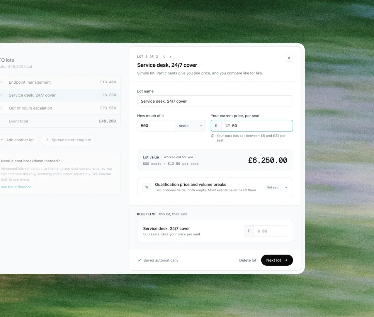
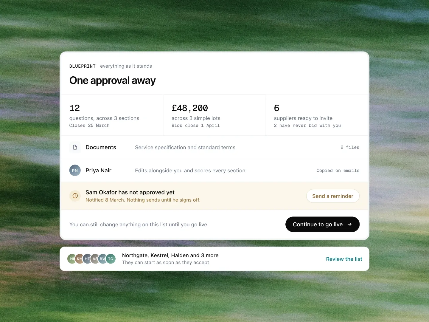
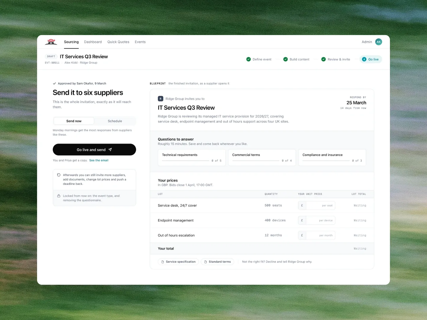
The rest is behind a key.
This one is still running, and most of it is under NDA. The research, the full flows, and the screens I cannot publish sit in the vault.
fig. 01 - 04 · dragconfidential
I was the only designer, so the product and the system had to be the same job.
Market Dojo is the Esker-owned procurement platform that had run more than £10.2bn of spend through 35,000+ events by 2019, for customers including Logitech, IWG, Al Naboodah and WOQOD. I am its only designer, working directly with the CEO, the head of product and the head of engineering.
I owned it end to end. Nothing arrived half formed and nothing got handed on before it was finished.
That meant owning the suite, the system underneath it, and how design gets decided with product and engineering. Decisions did not wait on design-review theatre, and the product stayed consistent without me in every file.
The system is what made that possible. One type scale, depth carried by hairlines only, colour rationed so an accent always means something specific, and every number set in mono so it reads as data. Those rules travelled across the suite so a new screen did not invent its own language.
I went through the live product screen by screen and logged 131 specific problems. They did not come from taste. About half came from GitHub issues, a third from support queries, and the rest from external stakeholder feedback, including a few usability sessions: buyers and suppliers who could not tell what they were doing, or what happened next, without being told. I treated the 131 as one question.
Stakeholders said it out loud: vague, not direct, confusing. They could not tell what a control would do until after they used it. Rewriting the copy (context and guidance at the point of the decision) is what made it readable.
That meant rewriting labels into plain language instead of internal jargon, stating consequences at the point the decision is made rather than in a footnote, and running a contrast audit that changed the palette rather than the other way round. Two greys that could not pass at any size were retired, and the green and the teal were darkened until text on them held up. The screens above come from the redesign of the event flow that followed, redrawn for this page, the last one animated.
Support tickets on sourcing event setup dropped 43%, task completion went from 71% to 88%, and median setup time fell from 32 minutes to 17, measured in Amplitude and the support tool, Q2 2025 against Q2 2026. Those numbers come from fixing the audited problems in the live flow, before the redesign. The 131 were how we found the problems. These are what changed.